Getting an overview
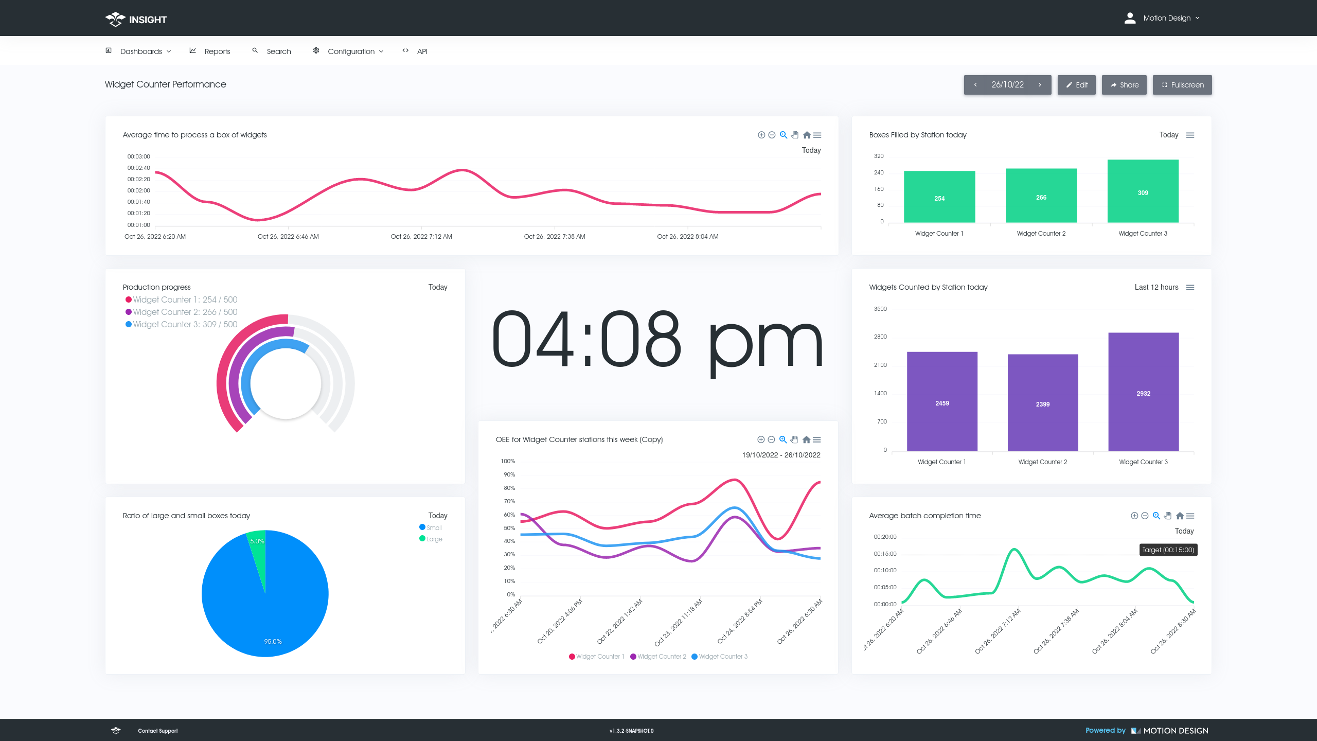
Custom Dashboards
Custom dashboards allow you to present a set of Graphical Reports on a screen. Display your dashboards on TV’s or monitors around your labs/factories or just have them available on your browser.
- Highly configurable
- Position and size your custom made reports anywhere on the screen so the layout makes sense to you and your teams.
- Time travel
- Use the date picker to quickly see what your dashboard looked like yesterday, the day before or any other day to quickly compare days.
- Sharable
- Generate a sharable link for a dashboard that you can use on TV's or share with staff members who dont require logins.
- Focused
- A dashboard allows you to bring certain reports together, allowing staff to focus on whats important for them. Create a new dashboard for every focus area.

Visibility
Graphical Reports
Graphical reports allow you to quickly see how your business area is performing. Make high level decisions to prompt the right questions and keep your team running smoothly.
- Turnaround Times
- See your median time it takes from job arriving to job completed where arriving could be at your receipting area and completing could be delivery/dispatch.
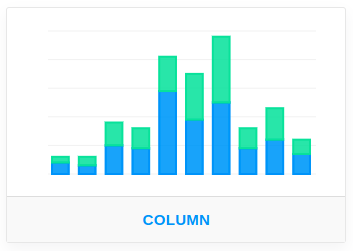
- Bar Charts
- Histograms are useful for comparing machine against machine, workstations against workstations, product types that are being processed.
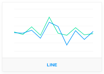
- Trends
- Trends can help show certain errors rise at certain parts of the day. Overlay today's performance with yesterday or last week's.
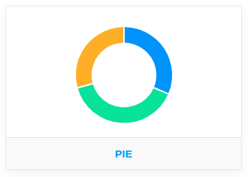
- Pie Charts
- Visually break down your total events by category or tag groupings.
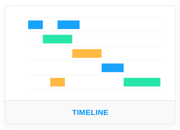
- Timelines
- Get a sense of where processes for a job start and end and where the big gaps/bottlenecks are within your business.
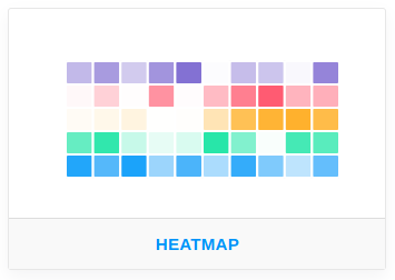
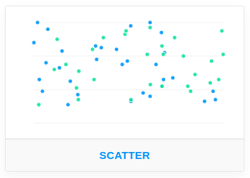
- Scatter plot & more...
- Display a scatter plot of your events to get a better understanding of the distribution of events over time. You can also create Gauges, Percentage, Heatmaps with more to be added.

Drilling Deeper
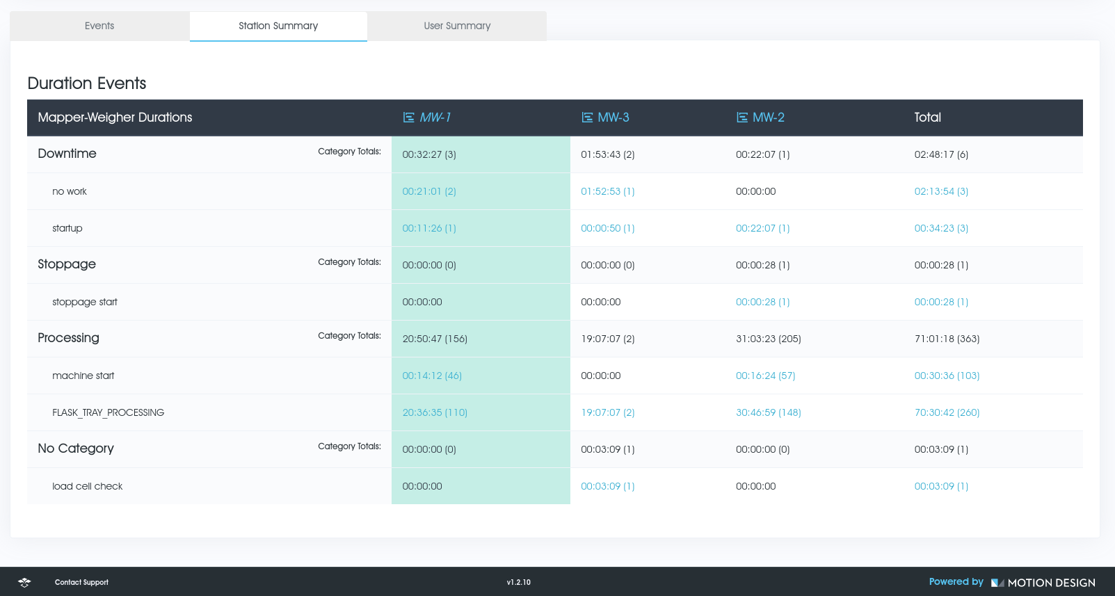
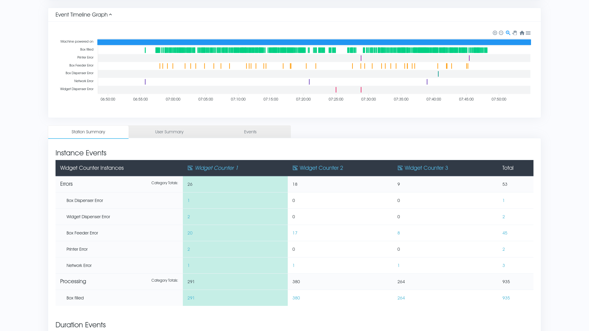
Tabular Reports
Make use of automated tabular reports on selected machines and events of interest.
Group events by Station
View Stations events automatically categorised by event types and then drill deeper into those events by clicking on them.
Group events by Operator
The same tabular reports for Stations can also be used for reporting on operators and their performance.
Station Timeline
Being able to view a timeline of selected event types for a selected station or operator visually, is a great tool for seeing when something happened in conjunction with other events.
Visualise
Timeline View
Visualise your events to get a better perspective of whats happening when.
Visualise
See events in order/overlapping rather than just numbers in a report.
Analyse
The Timeline View can be a great asset for helping spot bottlenecks and other issues within your process.
Context
Seeing when errors or stoppages happen in context with other events can help you spot root causes and other problems.
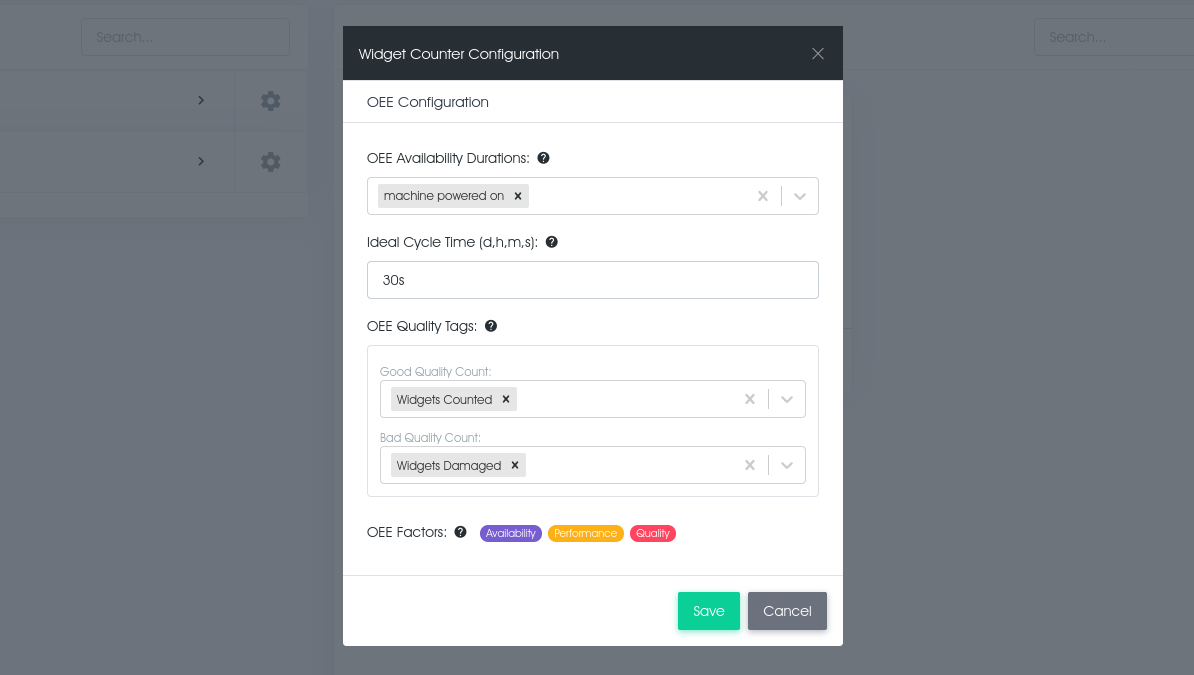
Overall Equipment Effectiveness
OEE Reporting
Overall Equipment Effectiveness is the gold standard for measuring manufacturing productivity. Read more about how it works at oee.com
- OEE per Station
- OEE can be easily configured per Station Type and reported on per Station. Each Station Group has its own Schedule that you manage for Planned Production Time.
- OEE Events
- Simply define which events (that the machine is already sending) count toward it's Availability, Performance and Quality. The report will take care of the rest.
- OEE Report Options
- You can display your OEE as a percentage, gauge, pie chart or a trend over time. The latter can help you see how the machine is performing day after day.